Shade between copper and brown
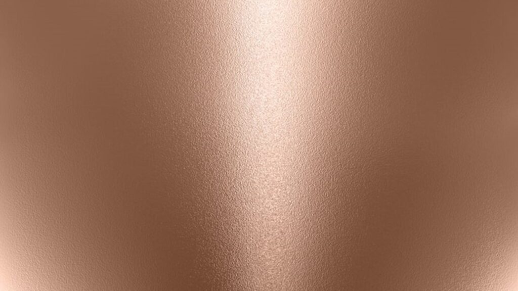
Colors that sit between warm metal tones and earthy neutrals often feel both classic and versatile, because they can read as elegant like a polished surface while still feeling grounded like a natural material. This in-between look shows up in fashion, interior design, makeup, car finishes, and graphic work, where people want warmth without the brightness of gold and depth without the heaviness of dark brown. The tone usually carries a muted shine or a soft metallic suggestion, and it can shift slightly depending on lighting, surrounding colors, and texture. The shade between copper and brown is bronze.
Bronze is a warm metallic tone that bridges copper’s glow and brown’s earthiness
Bronze sits in the visual space where copper’s reddish warmth starts to deepen and quiet down into a more grounded, brown-leaning finish. Copper is typically brighter and more orange-red, often with a lively shine that feels energetic and fresh. Brown, on the other hand, is more muted and earthy, associated with soil, wood, leather, and other natural materials. Bronze blends these qualities, keeping the warmth and metal-like richness of copper while adopting the calm, depth, and neutrality that brown provides. This is why bronze is frequently described as a “warm, deep metallic” rather than a high-shine, bright metal tone. It reads as sophisticated because it feels less flashy than gold, yet still carries a refined glow that plain browns do not have. The result is a shade that can look luxurious without being loud.
Bronze can look more copper or more brown depending on light and surface texture
One reason bronze is easy to recognize but hard to pin to a single exact swatch is that it changes with lighting and texture. Under warm light, bronze can lean closer to copper, showing more orange and red undertones and appearing brighter on highlights. Under cooler light, bronze often looks deeper and more brown, sometimes appearing slightly olive or smoky in shadowed areas. Texture matters just as much. A glossy or polished bronze finish reflects light strongly, bringing out the metallic aspect and making the color appear lighter and more copper-like. A matte bronze finish absorbs more light, pushing the shade toward brown and making it feel more subdued. This shifting quality is part of bronze’s appeal: it can behave like a neutral in one setting and like a statement metallic in another, depending on how it is used.
Bronze differs from gold, brass, and copper in undertone and “temperature”
Bronze is often confused with nearby metal colors, but its undertone makes it distinct. Gold is generally brighter and more yellow, often feeling sunny and luminous. Brass also leans yellow, though it can appear slightly greenish or duller than gold. Copper is more red-orange and typically looks more vivid, especially when polished. Bronze is darker and less yellow than gold and brass, and less red-bright than copper. It tends to feel “warmer” than many browns because of its reddish base, but it also feels “deeper” and more neutral than copper because brown influences the overall tone. When people want a metallic that feels timeless rather than flashy, they often choose bronze precisely because it sits in that calm middle ground.
Bronze works as a design neutral because it harmonizes with many color families
A key practical reason bronze is popular is that it pairs well with a wide range of colors. With neutrals like cream, beige, taupe, and gray, bronze adds warmth and richness without clashing. With deep tones like navy, forest green, burgundy, and charcoal, bronze provides a soft metallic highlight that looks mature and balanced. With lighter pastels, it can add contrast and depth, preventing a palette from feeling too sweet or washed out. Bronze also complements natural materials—wood, stone, clay, linen—because its brown side echoes earth tones, while its metallic side adds a polished finish. This dual personality makes bronze useful in interiors as hardware, lighting accents, frames, and decor, and in fashion as jewelry, buckles, buttons, and metallic fabrics.
Bronze is common in makeup and fashion because it creates warm dimension
In makeup, bronze is closely associated with bronzer products that give the skin a sun-warmed look without looking overly orange or too dark. The color works because it mimics natural warmth and shadow together, which creates dimension on the face. Bronze eyeshadows are also popular because they flatter many skin tones and eye colors, providing shimmer and depth in one step. In fashion, bronze fabrics and accessories can elevate an outfit without the high contrast of bright gold or the coolness of silver. A bronze bag, belt, or shoe can act like a warm neutral, coordinating with black, white, denim, and earth-toned clothing. Because it sits between copper and brown, it often feels especially natural alongside autumn palettes—rust, olive, camel, cream—while still working year-round in more minimal wardrobes.
Bronze appears in materials and finishes that suggest age, durability, and heritage
Even when people refer to bronze purely as a color, the word carries associations that shape how the shade feels emotionally. Bronze suggests durability and tradition, partly because it is connected to historical objects, sculptures, medals, and decorative hardware that develop character over time. A “bronze finish” often implies a slightly aged or brushed look rather than a mirror polish, which can make spaces feel warmer and more lived-in. In home design, oil-rubbed bronze and antique bronze finishes are popular for this reason: they provide depth, hide fingerprints better than shinier metals, and add a sense of classic craftsmanship. This makes bronze especially appealing when someone wants elegance that feels comfortable, not sterile.
How to recognize bronze when comparing similar warm shades
If you are trying to identify bronze among nearby tones, look for three markers: warmth, depth, and a softened metallic quality. Bronze should feel warmer than plain brown, but not as bright or orange as copper. It should feel deeper than many golden metals, with less yellow and more earthy grounding. And it should have a subtle metallic richness, even when the finish is matte, meaning the color seems to hold a quiet glow rather than looking flat. If a shade looks strongly yellow, it will read more like gold or brass. If it looks strongly orange-red and bright, it will read more like copper. If it looks purely earthy with no metallic richness, it will read more like brown or umber. Bronze is the steady middle: warm, deep, and gently metal-like.
Bronze is the color that naturally sits between copper’s warm reddish glow and brown’s grounded depth, giving a rich, muted metallic tone that works as both a statement finish and a versatile neutral.

Benzer Konular

4. BÖLÜM: Geometrik Örüntüler Örüntüyü Tamamlayalım, Örüntü Oluşturalım Annem, evdeki artık kumaşlardan bir örtü dikti. Kumaşların bir kurala göre birbirini takip ederek devam etmesine dikkat etti. Murat’ın annesi, üçgen örüntüleri kullanarak örtüyü dikmiştir. Murat’ın annesi, evdeki artık kumaşları değerlendirerek çok güzel bir örtü dikmiştir. Bu örtüyü dikerken dikkat ettiği en...

Etkinlik 1Adı: Çevremizde Neler Oluyor?Amaç: Evrendeki mükemmel düzene ilişkin gözlem yapabilmeBeceri: Tümevarıma dayalı akıl yürütmeMalzemeler: Not defteri, fotoğraf makinası, telefon, tablet vb. Ön Hazırlık1. Bir hafta boyunca çevrenizi gözlemleyerek evrendeki düzen hakkında gözlem notu oluşturunuz.2. Gözlem notlarınızı ve fotoğraflarınızı sınıfta paylaşmak için dosyalayınız.3. Gördüğünüz doğal güzellikleri, ilginç tabiat olaylarını ya...

Uçak, helikopter gibi hava taşıtlarını kullanarak insanları ve yükleri güvenle bir yerden başka bir yere götüren kişiler vardır. Onlar gökyüzünde yol alır, hava kurallarına uyar, yolcuların güvenliğini sağlar ve büyük bir sorumluluk taşır. Bu mesleği yapan kişiye pilot denir. Pilot Kimdir? Pilot, uçak, helikopter gibi hava taşıtlarını kullanan kişidir. Onların...
Bayrak ve Vatan Sevgisi Kompozisyon Giriş Bayrak ve vatan sevgisi, bir milleti ayakta tutan en güçlü duygulardan biridir. Vatan, sadece yaşadığımız toprak değildir; dilimizi, kültürümüzü, anılarımızı ve birlikte kurduğumuz hayatı kapsayan ortak yuvamızdır. Bayrak ise bu yuvanın bağımsızlığını, birliğini ve onurunu temsil eden en görünür semboldür. Bu nedenle bayrağı sevmek,...

_____ insanlar benden uzak dursunlar. diye sorulan bulmaca sorusunda boşluğa gelebilecek insan özellikleri hangileridir? Soruda boşluğa gelebilecek insan özellikleri cümlenin yapısına göre olumsuz nitelikler olmalıdır. Bunlar, insanların genellikle çevrelerinden uzak durmak istediği, güvenmediği veya hoşlanmadığı özelliklerdir. Bu tür insanlar, sosyal ilişkilerde sorun yaratabilir, güveni zedeleyebilir veya moral bozabilir. Boşluğa gelebilecek...

Dünya, dışarıdan bakıldığında küresel bir yapıya sahip, üzerinde yaşam barındıran bir gezegen gibi görünür. Ancak gezegenin iç yapısı çok daha karmaşık ve katmanlıdır. İnsanlar yeryüzünde yalnızca kabuğu görebilir; ancak bilim insanları çeşitli jeofiziksel yöntemlerle (özellikle depremlerin yarattığı sismik dalgaların incelenmesiyle) Dünya’nın derinliklerinde farklı katmanlar bulunduğunu keşfetmiştir. Bu katmanlar kabuk, manto,...
Bir Yorum Yazın
Ziyaretçi Yorumları - 0 Yorum